You think it helps the players in mapping, too? I can point to any number of 3 or 4 sheet maps my players have made simply because they did not start mapping at the exact spot in the graph paper that would make their map fit. And giving that spot away is giving away too much information - robbing your players of the mystery experience. As, eventually, they will be cheated of that experience when the grand design all comes together, the edges of the underworld resolve themselves, and they realize that lo, they have been living in a jar of Tang.
 |
| Intimations of quadrangular cosmic order |
 |
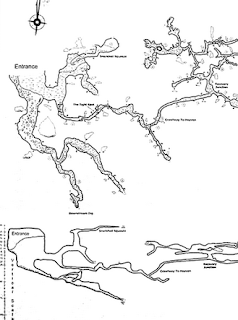
| Only about 1/5 of a long, twisty, branching cave. |
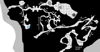
Although I can't deny its traditionalist charm, the flat rectangle is only barely admissible as architecture and frankly implausible as natural topography. Some doubt that exact mapping is useful or desirable; I'm not one of those. Having the world come to life on graph and hex paper is part of the exploration experience in the traditional game that I wouldn't give up for anything. But the quad-rules rectangle should feel like a window into a world with its own existence - not a prison for a plan of an artificial playground.


They are not very realistic but the blue 8 1/2 x 11 maps do scream D&D. I have used both for different purposes.
ReplyDeletehttp://castletriskelion.blogspot.com/
Back when I was still doing most of my mapping on grid paper I'd trip up players by using huge sheets of graph paper and folding them over and having levels flow from one fold to the other or have a sub level fill a corner of a sheet the base layer didn't cover. Making it hard to guess where things go is part of the fun.
ReplyDelete