
Meanwhile, I'm looking at my own efforts and some others' in the genre and trying to determine what the right mix of graphics and text is for me. My first effort was graphic-heavy:

But a little cryptic, especially to the right with the chest and door. A reader also needs to know how damage can come to be applied against a particular piece of equipment, and that the weird shield at bottom is made of metal. A little more text wouldn't be amiss here.
 |
| There's art under there ... |
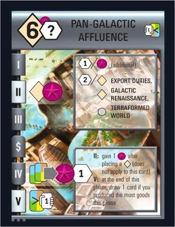
But some of the effects in Race are too cryptic for the all-graphics approach. They're explained in text on the card, which supports an accompanying graphic that most of the time will not stand on its own as an explanation. This, of course, undermines the multilingual rationale for the glyphic language. But could there be another reason to wed text and symbol?
 This is how I see graphics and numbers on my One Page Rules. They're there to break up the monotony and allow a quick visual reference. But unless they're truly representational and understandable icons, they'll be backed up with text. A kind of Rosetta stone for a visual language that's quickly learned, to back up the verbal lesson with a quick glance in play. Symbols interspersed with more iconic silhouettes and illustrations.
So, pop quiz: can you guess at a glance what each of these symbols at left represents in my rules?
Also check out the one-page efforts of Telecanter (there should be more in the archives) and -C at Hack and Slash.


