Showing posts with label graphics. Show all posts

Tuesday, 28 January 2014

Look At The Size of That Sarcophagus

I know I was going to write about fantasy-science today but Athanasius Kircher (previously) stole my heart away:


By Thoth and Amon, click to enlarge and you'll see a method of depicting a subterranean labyrinth at once outlandish and practical; emulated, perhaps unconsciously, in Jason Thompson's fine visualizations here.

The best part? This illustration comes from Kircher's attempt to perform Egyptology without having actually visited Egypt. Yep, those are supposed to be the Great Pyramids ... but they belong to all of us now.

Thursday, 28 February 2013

Dungeonteller: Amazing Pictorial Play Aid

You should know, if you don't already, that I'm a big fan of graphically enabled, boiled down adventure game rules; also, that a good chunk of this blog is about my attempts to create such rules; also, that I'm not the greatest freehand artist, which I compensate by using an Isotype-style design aesthetic, so I stand perpetually in awe of works like Kata Kumbas with their gorgeous illustrated equipment shops and catalogues.


Another enviable work, just released  by Doug Anderson of the Blue Boxer Rebellion blog, is the kid-friendly player pack (pdf) for his RPG Dungeonteller.

One page rules supplements, you say? Procedural rules for the whole game are a spacious, breezy one page. The rest is content, including great character illustrations, and equipment-shops with price tags. Many neat touches, including different font sizes to make your character's good skills really stand out. Advancement, resolution, basic equipment - everything for players is here, on an ample and very readable two-sided character sheet.

A more conventional presentation of the full Dungeonteller game can be found here (pdf), including a nice little tutorial scenario. Both downloads are free.

Wednesday, 12 December 2012

ISOTYPE

Nowadays we take this kind of graphic for granted, as a staple of the more highbrow kind of serious news outlet:

Number of cars in USA vs. rest of world, 1914-28
 The style has a name. It is ISOTYPE, a movement that most people probably don't even know was a movement, let alone its connection with social democratic ideologies in 1930's Germany. If you've ever been told in a statistics class that icons should illustrate quantities by varying in number, not size, you've learned one of the main principles of ISOTYPE design.

The influence, indirectly, on my own 52 Pages approach can't be underestimated.

Lifespan of animals
Lifespan of monsters (under attack from adventurers)
Maybe it's a little incongruous to illustrate rules for adventures of swords and magic using a Modernist graphic language developed in the 1930's. And maybe not - considering it's not the real ancient world or Middle Ages our games are simulating, but fictional products of 20th century fantastic writers. ISOTYPE is industrialization, but also does surprisingly well at accompanying the standardization of pulp literature into rules and monster statistics.


More stuff:

Gerd Arntz collection of ISOTYPE icons.
Links to essays on ISOTYPE.


Thursday, 18 October 2012

Adventure Format: All On One Spread

Just a quick sharing of an idea I had. Working on an adventure that will form the first "leg" of a larger megadungeon (and a stand-alone experience even if the whole thing is never finished), it occurred to me to banish two of the most frequent action-stoppers when I GM -

Pausing to look up monster stats

Pausing to look up the map.

So why not take a cue from one-page dungeons without being literally one-page, putting everything you need to know to play in a given section of the adventure on one two-page spread?

Below - intentionally at low resolution for now - is how that has turned out. Beside the map is a section with minimal monster stats, and space below each monster listing to mark hit points or make notes. I'm a believer in letting DMs roll their own hit points, especially because systems disagree on what a monster hit die should be.


There's going to be a larger map that shows how all the sections hook up, and probably it's a good idea to put notes about which pages the passages off map lead to, once I have that arranged.

Thursday, 27 September 2012

Chase, No Words

What do you think? Is this a clear enough expression of the basic chase rules from earlier this week (everything except "losing sight")? Or does it come across more like a rebus you have to figure out? What icons or symbols would you add? Where do you need some words to come in?


Wednesday, 26 September 2012

In Search of the Universal Visual Language

Players of the "Eurogame" type of board game may have noticed that often the cards, board and everything else but the rulebook are produced with a language-free iconography. This reduces the production costs for the international market, because only the rulebook needs to be translated.

But can these glyphs be deciphered without reading the rulebook in your native tongue? Getting this across successfully depends on communicating either in icons (pictures with a one-to-one, analog correspondence to the thing being described) or in universally accepted symbols (pictures understood to stand for a concept without depicting it literally.)

Sometimes this is easy:


From these tiles in the game Caylus, you can see that they either produce a resource cube of that color, give you a choice of two resource cubes, let you trade the resource cube for 4 cash (white here meaning any color), or build you another game element (at top left).
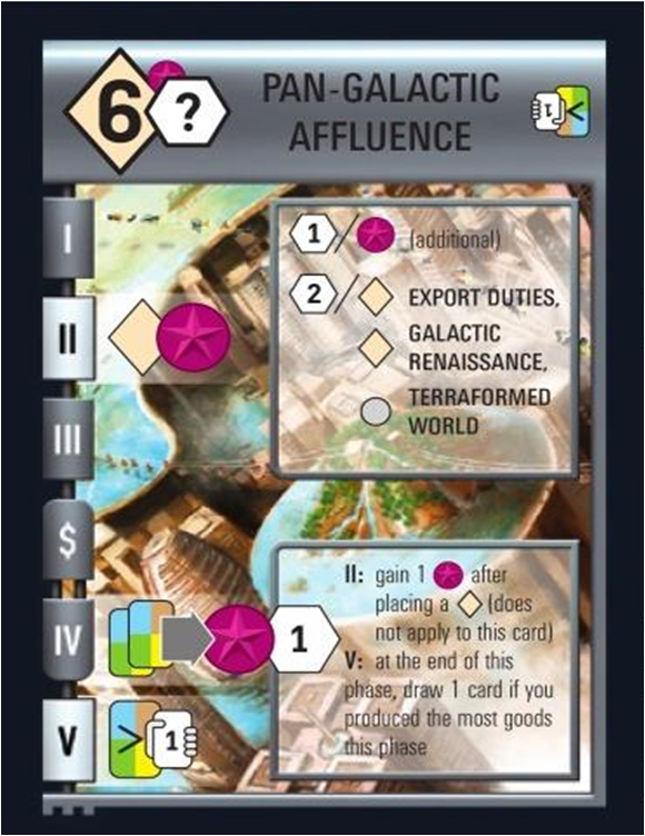
Sometimes, as I've pointed out before, this is hard:


The clear sign that the Race for the Galaxy designers have lost the plot by this expansion - if not before - is their need to explain the iconography in tiny text below. So do you have icons with illegible text on a see-through background, or do you have text with clumsy big uninterpretable icons? Hey, why not both.

I've been mulling over these issues because of a French-language blog that recently linked to me with praise for my old one-page graphic on breakage. While I was glad of that, it made me think that part of the appeal was the language-free simplicity of that graphic. Most of my One Page graphics since then have had a lot of words on them, getting away from the original inspirations by Telecanter that he has produced more or less word-free.

While it's easy to express graphically "5 or more points of damage breaks this," it's hard to put into pictures: "He heals one disease and, unless he makes a Mind save, may not use another miracle that day." Things that are hard to express are those that need symbols rather than icons. A few symbols like the arrow of sequence or causality, or the red X of negation, can be used in limited senses. But how do you express choices or conditional statements? With a flowchart? Even negation is often ambiguous. if you have a red X over a sword does it mean you can't attack, can't attack with bladed weapons, with swords in particular - or you can't be attacked with all those possibilities? Or can't carry a sword?

I use the One Page format to keep rules to a basic level of simplicity. Would No Words be even simpler? Could you even code D&D that way, let alone my fancy house rule D&D with all the subsystems?

In any case, I'll be looking back as I review my One Page rules to see if any bits of text can go. And next time I'll show my attempt at a No Words version of the chase rule from the previous post.

Thursday, 20 September 2012

On the Resolution of Tropical Beasts

The big silhouette .zip file expands yet again with a bunch of beasts for the Warm/Natural table.


I have to give fair warning - all these silhouettes are done at a scale with 250 pixels as their maximum dimension, so they can fit into Hexographer. They are also all-black - no grays for smoothed pixel edges, because when made transparent those just halo the image. So, at larger resolutions they may look grainy.

To be fair, some of Telecanter's original silhouettes have the same problem, as you can see from Adventurer Conqueror King where they were used as spot illustrations. Now there's a daunting task - to go back through my collection, sometimes revisiting the source files, to try and reconstruct every silhouette at a higher res!

Any interest in a silhouette tutorial? I've developed my chops in the freeware paint program GIMP to the point where, once I grab an image with good edge definition, it's a pretty quick road to the finished silhouette.

Sunday, 15 July 2012

Evil

Once I stopped trying to fit the different monsters of the "Evil" category into terrain types, doing the encounter table became a lot easier. Roll d4 to find the row, or d6 if with a water feature, where 5 or 6 means you look up the appropriate water row.


Again, this is one of six categories that's placed into a higher-level encounter table at different frequencies depending on the nature of the area. Here are a couple of rows of the higher-order table to illustrate. 3 and 18 are special encounters, detailed elsewhere.


And, the new silhouettes, together with an update of the download file on the right.


I can hardly believe that I've done 5 out of 6 of these, although there is still some clean-up work to do on the whole project ... for example, special Natural and Savage tables for arctic and tropical regions, plus the full table system, explanations, notes on some of the civilized encounters and possibly silhouettes rather than the generic "settlement" symbol for those.

Saturday, 19 May 2012

Silhouettes From Arcadia

Another silhouette post, now getting into the fourth page of the outdoor encounter table - "legendary" monsters - along with a few Weird leftovers like the mussels. This table isn't really meant to be the most frequent option, unless you are running some crazy sylvan-Olympian kind of region.


I notice also that myths have a lot of flying monsters, and they appear on this chart a lot more than the others. "Give it wings" is a natural, if trite, way to make a heraldic beast. Dragons also appear here; kind of rare, but the evil ones also appear on the Evil chart, number 5.

More thoughts about flying monsters, after a play report from one of my players.

Monday, 23 April 2012

One Page Dungeon (?) Entry Preview

I'm not really entering a "dungeon" in the OPD contest this year ... it's more of a hexcrawl, with an easier-to-understand version of the original hexcrawl rules, keys for each letter and icon, and a hexmap. Part of which currently looks like this:


 Between this effort and almost finishing the Weird encounter table page I've added 30+ icons to the Menagerie download, including several Fiend Folio, MM2, and Varlets & Vermin creations. Here they are on parade:

Click to enlarge.


Thursday, 12 April 2012

Menagerie 2

The public domain-based menagerie download zip (rules and tools, right) just got updated with a bunch more silhouettes. As fun as kitbashing miniatures and less messy ...


I had a hard time with the ankheg and bulette until another trawl through the Phylopic site found me some base images that just needed a little carving and filling to do. The Kenku is a mix of Hokusai and Kuniyoshi parts, and the pose is characteristic of those artists.

Yes, we're dipping into the Fiend Folio and Monster Manual 2. I'm putting the humanoids into the "Evil" encounter page and the giant invertebrates into a "Weird" encounter page, and the weirdos need company. Not even Basic D&D and Runequest will be safe from the monster raiding ... and maybe there's a post in that.

Tuesday, 27 March 2012

Menagerie 1

Short break from the high-level combat series as I take the opportunity to share some of the silhouettes I've been making for the somewhat insane project of illustrating a 480 cell random outdoor encounters table. Trying not to overlap with Telecanter's ongoing efforts here ...


These are formatted as transparent and 250 px maximum dimension to mesh with Hexographer. All are derived from public domain sources. Download link is "Menagerie 1" at the right. Stuffit Expander to expand.

Werecreatures are kind of challenging to do ... (one's a wererat and the other's a wereboar.)

Tuesday, 13 March 2012

Orc, Hobgoblin, Wilderness

There are a couple of pending things to do ... secret societies, equipment lists ... but for now I thought I'd share a couple of silhouettes I came up with on the weekend ...
Samurai-based hobgoblin
Legionary/boar-based orc


Not unrelatedly, I also bought the pro version of Hexographer. Remember my wilderness icons and encounters system? I'm finally getting around to assembling enough of a collection, from Telecanter's and other sources, to be able to share a Hexographer icon set. Being able to add numbers with the "decorations" feature helps enormously.

Here's an initial look.


The numbers and letters on the side are plainer (and I've given up on dice icons), but each one tells you at a glance its activity times (day, night or any), range in hexes, number encountered and total numbers (where it's not one or infinite).

Monday, 6 February 2012

Silhouette Jackpot

PhyloPic "stores free silhouette images of animals, plants, and other life forms. All images are available for reuse under a Public Domain or Creative Commons license." 

Telecanter, I think we just hit the motherlode.

Some choice picks:

Protoarchaeopteryx
Any old school game that has familiars should think seriously about the criminally neglected archaeopteryx.

Kelenken guillermoi
Prehistoric goblins are riding these guys.

Homo sapiens sapiens
RUN!

Saturday, 10 September 2011

One Page Graphic Style

I'm deep in the one page project and have a bunch of new ones to dole out in the coming days.

Meanwhile, I'm looking at my own efforts and some others' in the genre and trying to determine what the right mix of graphics and text is for me. My first effort was graphic-heavy:


But a little cryptic, especially to the right with the chest and door. A reader also needs to know how damage can come to be applied against a particular piece of equipment, and that the weird shield at bottom is made of metal. A little more text wouldn't be amiss here.

There's art under there ...
One of the card games I play a lot is Race for the Galaxy, which has attracted carping about the complex system of graphic icons on the cards. This is a standard trick in Eurogames to allow them to print cards that work in all languages. Then they print a multilingual rulebook that explains all of those glyphs and numbers.

But some of the effects in Race are too cryptic for the all-graphics approach. They're explained in text on the card, which supports an accompanying graphic that most of the time will not stand on its own as an explanation. This, of course, undermines the multilingual rationale for the glyphic language. But could there be another reason to wed text and symbol?

This is how I see graphics and numbers on my One Page Rules. They're there to break up the monotony and allow a quick visual reference. But unless they're truly representational and understandable icons, they'll be backed up with text. A kind of Rosetta stone for a visual language that's quickly learned, to back up the verbal lesson with a quick glance in play. Symbols interspersed with more iconic silhouettes and illustrations.

So, pop quiz: can you guess at a glance what each of these symbols at left represents in my rules?

Also check out the one-page efforts of Telecanter (there should be more in the archives) and -C at Hack and Slash.

Thursday, 28 April 2011

One-Page Wilderness: The Graphics

Telecanter came up with a version of my one-page wilderness map that looks just great, with silhouettes. I'm building on it to get some of the useful information back on the hex while staying true to the iconic form. Range and day/night activity collapse into one hexagonal icon, blue dice-side icons provide the roll for number appearing. Total in lair, as well as "uh what exactly does this stand for again" can be subsumed in key notes for that hex's number (which Hexographer supports).


I also added a red flag icon for simple leadership structure in human-like groups. Roman numeral gives the number appearing that will include a leader of level (base +1), and doubling that will give further increases in the level of additional leaders encountered. For example, the bandits in the forest (V) are base zero-level, but have one level 1 figure for every 5, a level 2 for 10 or more, a level 3 for 20 and so on. If there are 5 bandit patrols averaging 9 each then the boss of all 45 bandits should be level 4.

Silhouettes for every monster, really? Well, it would be cool for other reasons, but I know of some resources that provide a start. The graphic fonts WWFantasy, Imaginary Forces, Mythologicals One, Mediaeval Bats, SL Mythological Silhouettes, and Time Warriors are all free, for one.

Thursday, 31 March 2011

Keep That Rule Simple, Graphically

Well, I did up the rule from last post as a one page, semi-literate graphic that you can read from 5 feet away. This is a great exercise in cutting rules flab and bringing it closer to something that will work in a game, because after the rule survives the Procrustean treatment, you can either memorize it or quickly consult it.

In fact, the restaurant Heimlich-maneuver chart treatment is the new acid standard for rules I invent if they're to be used in actual play. Either I should be able make a graphic like this, or it involves rolling dice and looking that one dice roll up on a table. A lot of my rules in squidgy type have fallen by the wayside at the actual table.

Click to enlarge ... if you really need to.